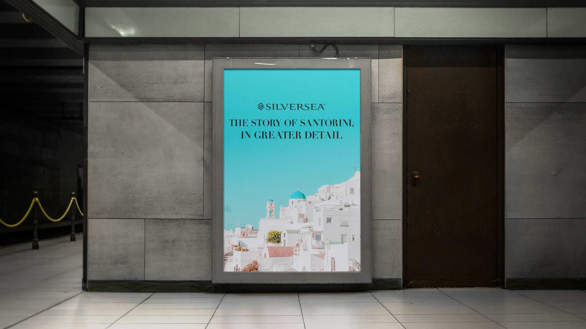
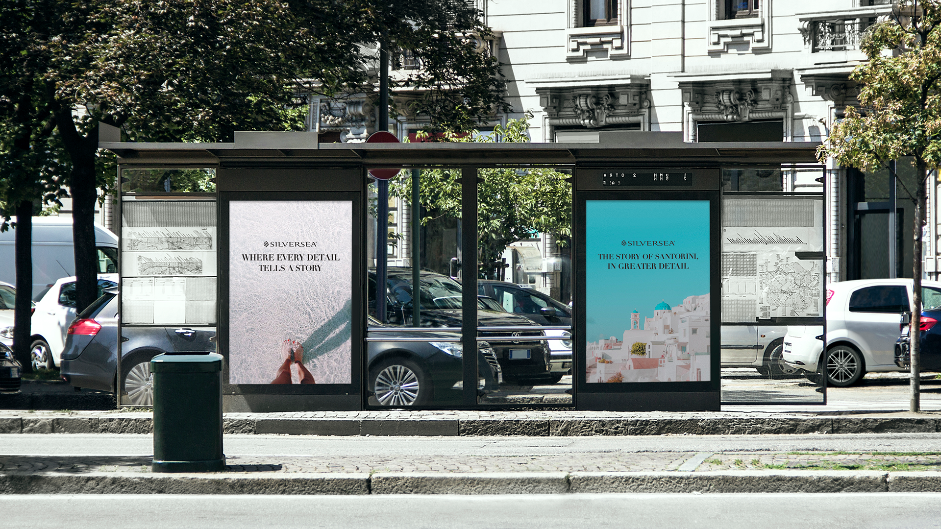
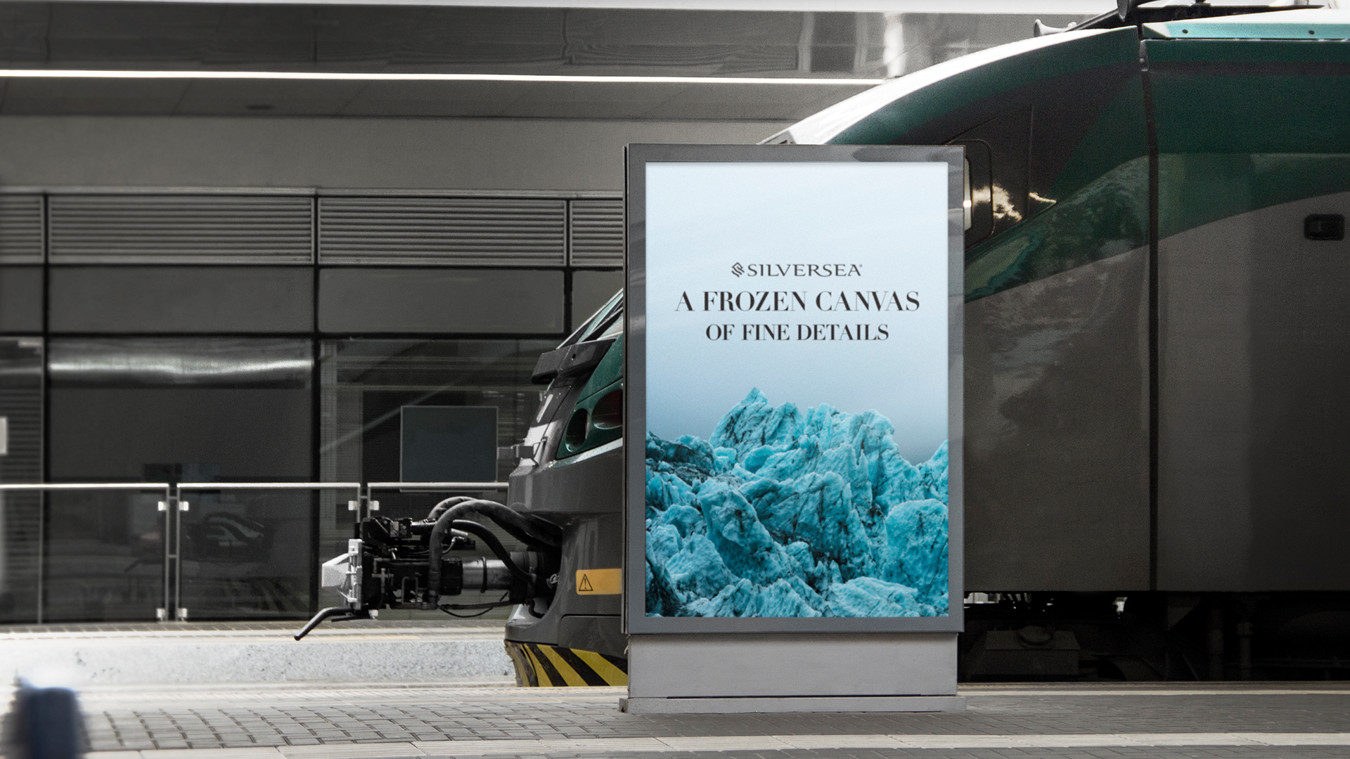
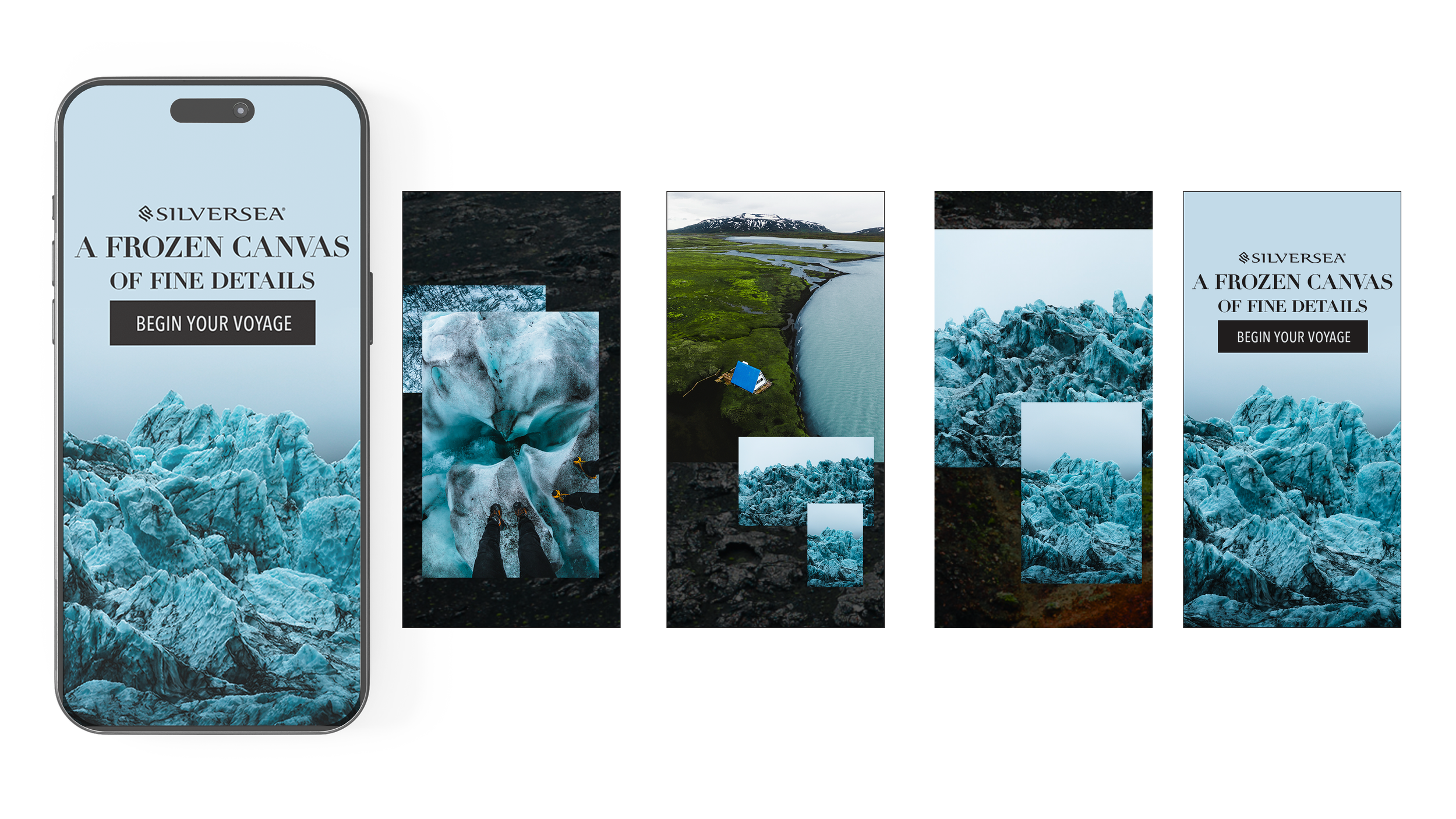
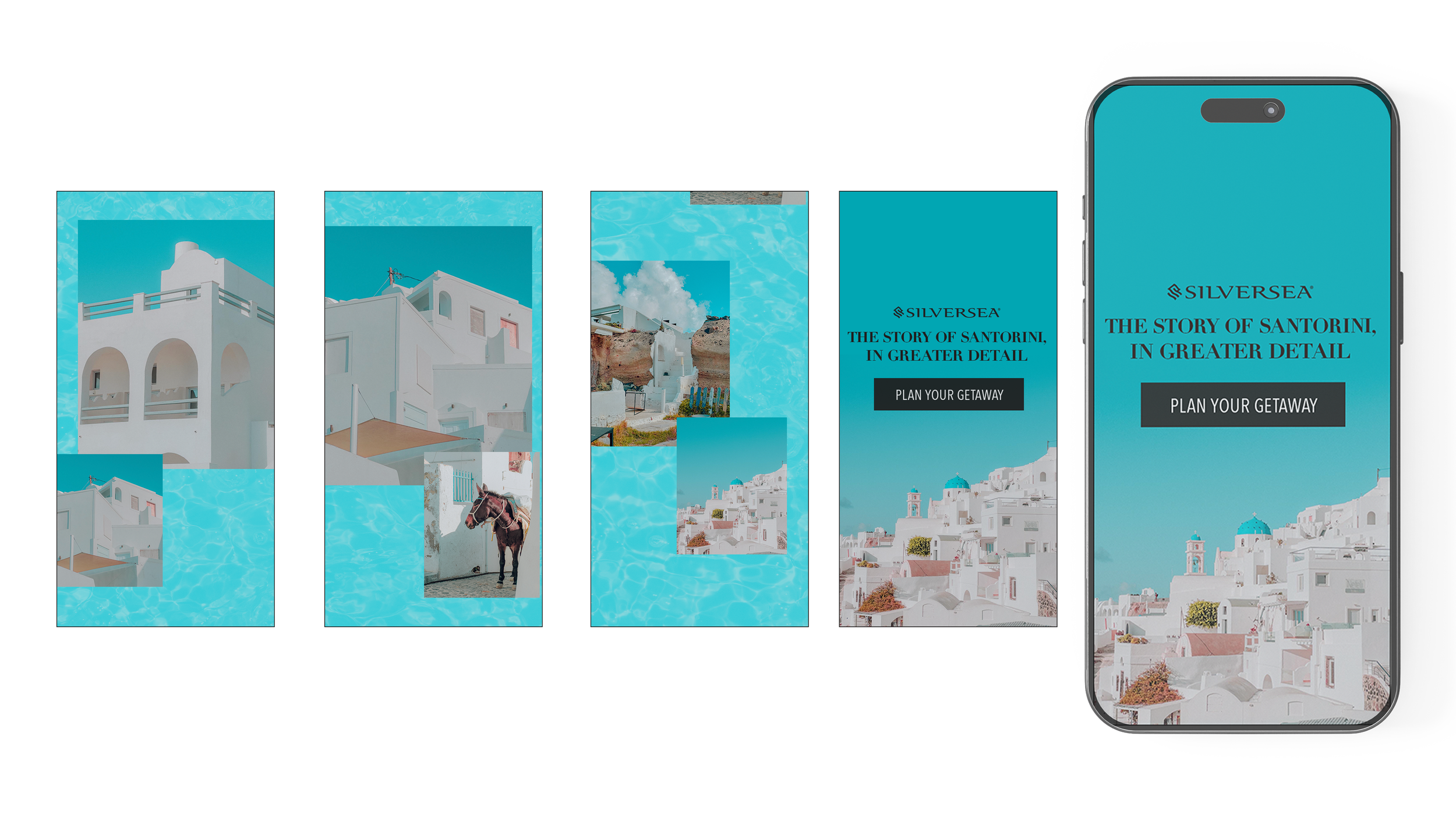
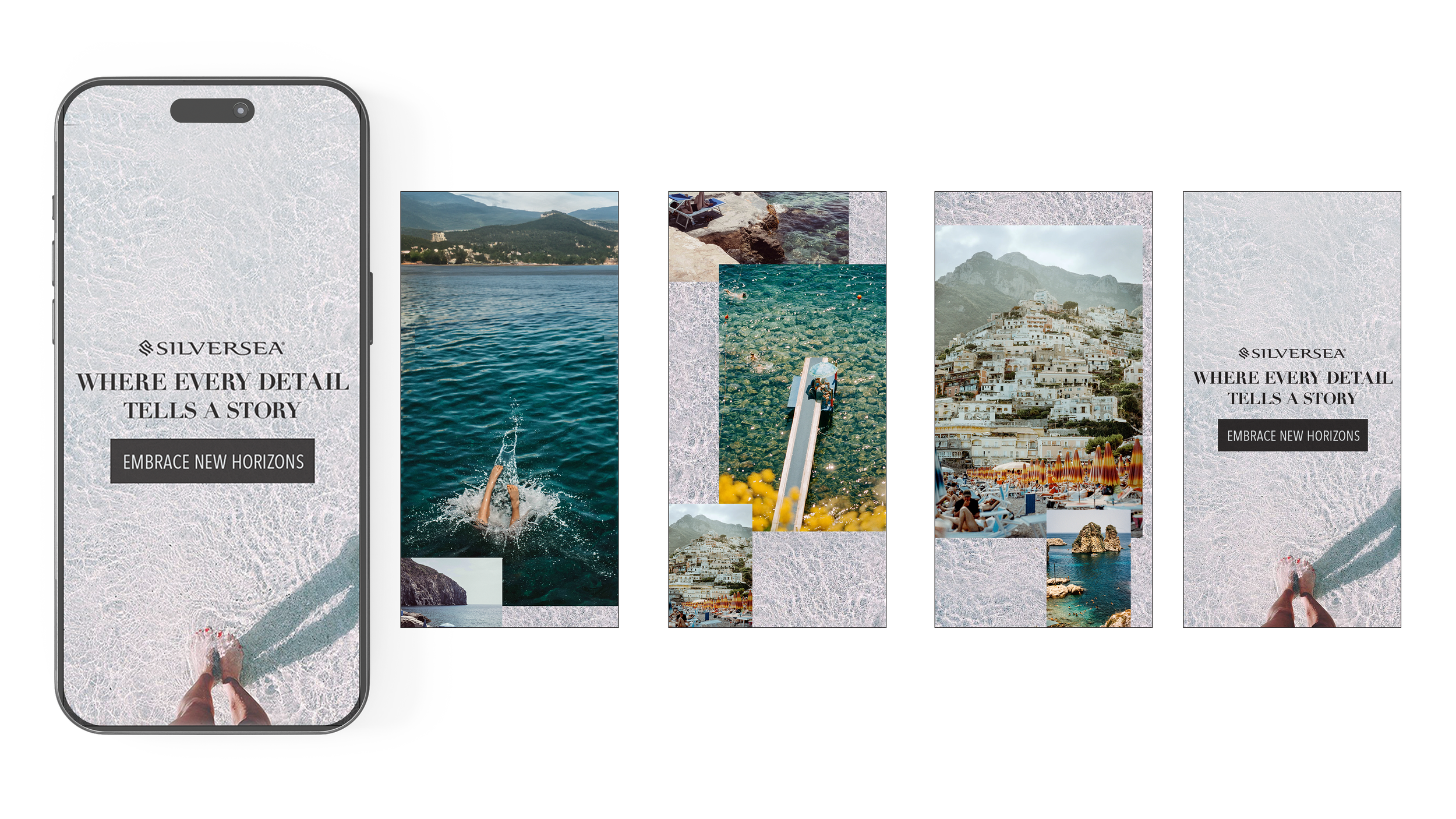
SilverSea

I had the opportunity to help shape a comprehensive campaign for Silver Sea, including animation, out-of-home signage, and digital and print collateral. As part of the process, I spent time exploring the work of independent photographers and filmmakers whose use of nostalgia informed the visual direction of the campaign.

Campaign


Concept

The concept centered on a sense of familiarity and quiet nostalgia. Drawing from nostalgic photography, the visuals aimed to feel lived-in and emotionally resonant, evoking memories rather than staging moments. This approach helped ground the campaign in warmth and authenticity, allowing the brand to feel both timeless and approachable.


Out of home

The concept extended naturally into out-of-home signage and animation, carrying the same sense of nostalgia into larger, more public moments. Subtle motion and restrained typography were used to echo the feeling of still photography, while the out-of-home placements focused on simplicity and atmosphere. Together, these elements helped the campaign feel cohesive across formats, maintaining a quiet emotional presence rather than competing for attention.


Banners

For banners, the concept was translated into a more concise, modular system. Cropped nostalgic imagery and minimal copy allowed the visuals to do most of the work, while gentle motion and pacing helped retain the campaign’s reflective tone. This ensured the banners felt consistent with the broader campaign, without losing clarity or impact in smaller formats.

Like what you see?

Let’s see what we can build together.

Get in Touch
Section_BG.png